Brand identity and perception
There’s nothing wrong with the quality of the ‘47 brand baseball hat I wore. The Phillies logo is a great design from the early 90s, which is a refined and thicker version of the one used from 1950-1959.
https://www.sportslogos.net/logos/list_by_team/70/Philadelphia-Phillies-Logos/
The red Phillies team color has been around for generations and part of their red and blue brand. However, combining them all could be misconstrued these days if you make assumptions about a red hat from a certain viewing angle.
Thankfully, this isn’t some cheap piece of junk made without care or craftsmanship or a political statement. It just represents a dedication to loyalty of a sports team, and a Philadelphia cultural norm.
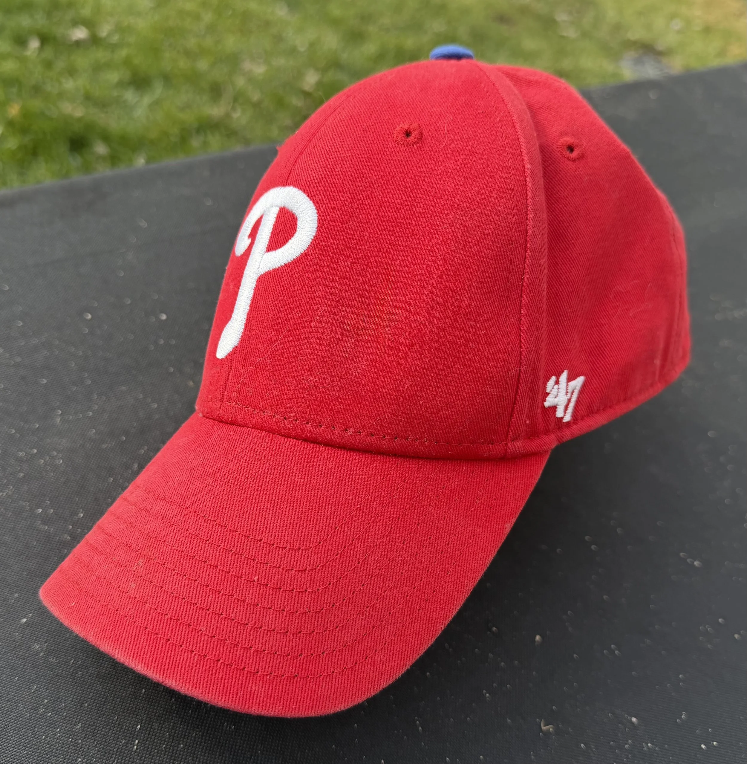
A photo of a Philadelphia Phillies hat with an unfortunate number in context to the team color.